Aubrey’s photos are very artsy. They are focussed in some places and very soft in others. He zooms in on interesting objects. He finds captivating things and edits them to make them even more interesting.
He uses lots of colors and edits his work to add textures and colors. He has a lot of darks and lights in his photos with lots of sharp contrasts. I really like his work and his editing is amazing.
Eliza’s photos flow very well; not only with each other, but within themselves. Her backgrounds integrate with the subject perfectly in that the subject stands out in the subtle scenery, but the background still holds it’s own beauty.
She directed her models very well in her series project and she used the obstacle of the wind and made it part of her photos by letting it blow in the subjects hair causing the picture to look very natural. I think that Eliza’s photos are very amazing and she has a unique and definite style.
Grace’s pictures are very raw. She doesn’t try to cover anything in them, she allows the subject to have little imperfections, so the edits that she does make are very well chosen and subtly add to the pictures.
In her series project on light she made the photo look like it was of a fluorescent light or the sun. Her photos focus more on the light, so the pictures tend to be a little washed out which is a cool effect. I really like her style.
Kendall’s pictures tend to be in black and white. She finds interesting patterns of a shadow or in a glass window or of chipped paint. Her photos are more abstract. She zooms in on interesting things in the world and makes a masterpiece out of the mundane.
Kendall either uses soft focuses or really sharp focuses, with lots of contrasts. When she edited in her experimental sketchbook, she drastically altered the coloring or texture of the photos. I think Kendall is an awesome photographer with a distinct style.
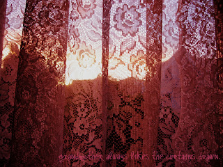
In her series project Lena added text to her pictures. She found perfect little lines to write on the photo to add even more personality to her already special photos. Her lines of text are very poetic and make you feel something when you read them.
The edits in her photos tend to be pretty bright, but before she started seriously editing her pictures they were dark. For example her Micro Fantasy series with the tiny soldiers and knights was dark and also very good. She is a great photographer.
Nora’s photos are great. She makes her pictures very raw, meaning she tends to purposefully do very little to touch up the photo during her editing phase, but when she does edit she goes wild with an incredible amount of color and creativity.
She uses hard focuses and sharp colors to draw out the beautiful subjects. She edits her colors very artsy, adding intense odd colors that make the photo pop. I love her photos.
Renna’s pictures are very artsy. She likes to use the style of fashion photography. I like how she takes pictures of zoomed in on a particular trait of her subject, like their feet or a feature on their face. I also like how she takes happy smiling photos on a white back ground with an overlaying texture.
I like the colorful tint of the photo. She manages to get an amazing amount of emotion in her picture. I am a huge fan of her style.
Sam’s pictures bring out the color of one thing and really extenuates the subject. He zooms in on a particular aspect of a beautiful picture making that one small thing giant and look so very important.
He tends to take pictures of plant life. He brightens the photo with direct lighting or editing on the computer after the photo is taken. I love his photos. They are so interesting and riveting to look at.
Zaina’s photos are very beautiful. In her song project she took landscape pictures to match with the mood of her song. She works to find little things that stand out and like shadows or chipped paint and she adds to their beauty with edits on the computer and sometimes a black and white style.
In her second Experimental Sketchbook, she she tinted the photos and extenuates their innocence. Also in her other Experimental Sketchbooks she works with glassy textures, makes the photo look like a drawing where the edges are scattered but defined, and she added artificial movement. I tried to mimic these attributes when I attempted to copy her style.
Zephy’s pictures are very forward, she tends to have the subject in a pose facing front. When she doesn’t take beautifully posed photos she uses inanimate subjects like buildings or flowers.
Zephy edits beautifully. She likes to use the interesting edits, like neon. When I duplicated her work, I tried to capture the creepiness of her photos to go along with her neon editing, so I faded the neon edit to give the picture a certain scariness.


